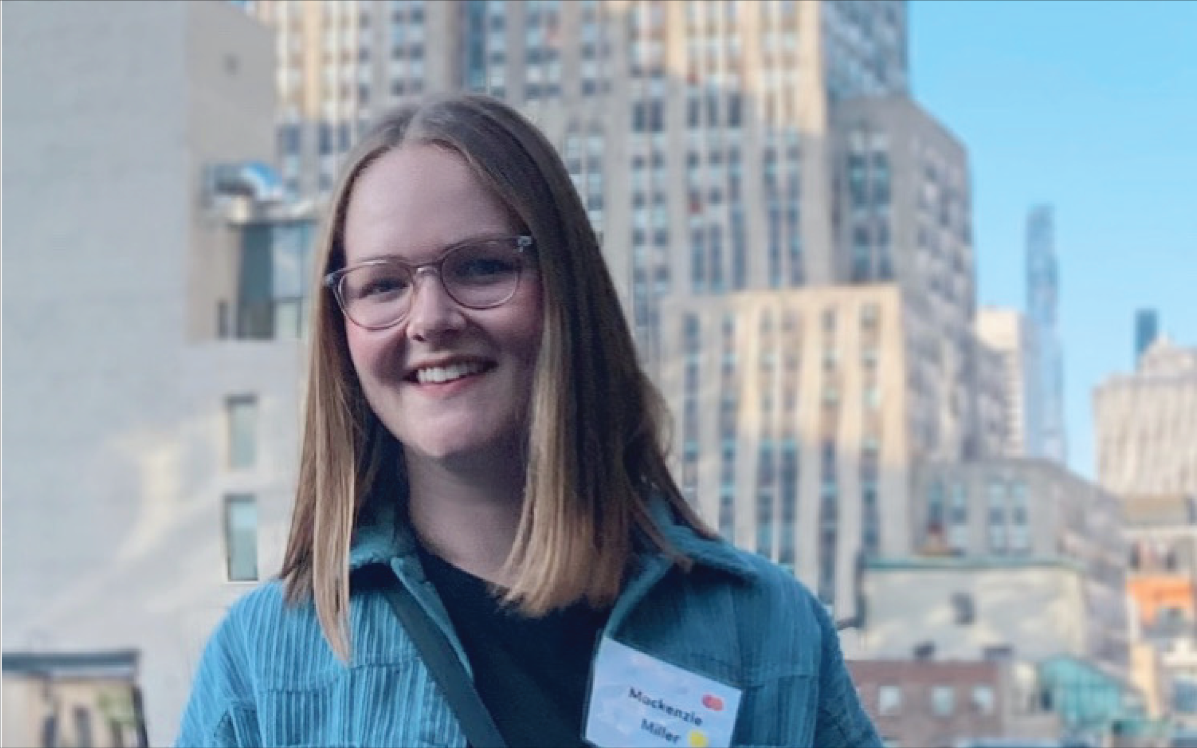
Data-driven and user-informed, Mackenzie's design work has contributed to award-winning projects in the US, Europe, and Africa. Her clients range from news publications to international nonprofits, all with the common goal of improving data visualization capabilities for internal and external facing projects.
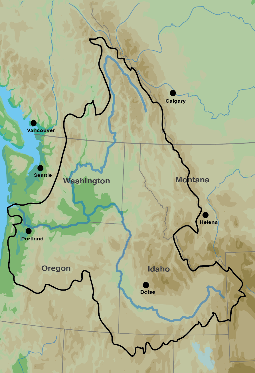
Pacific Northwest Map
Adobe IllustratorI recently designed a print graphic that involved a very striking map of the Columbia River Basin because there wasn’t a more modern digital map of the Basin. This map includes some elevation levels and major cities/rivers around the Basin, while maintaining simplicity.
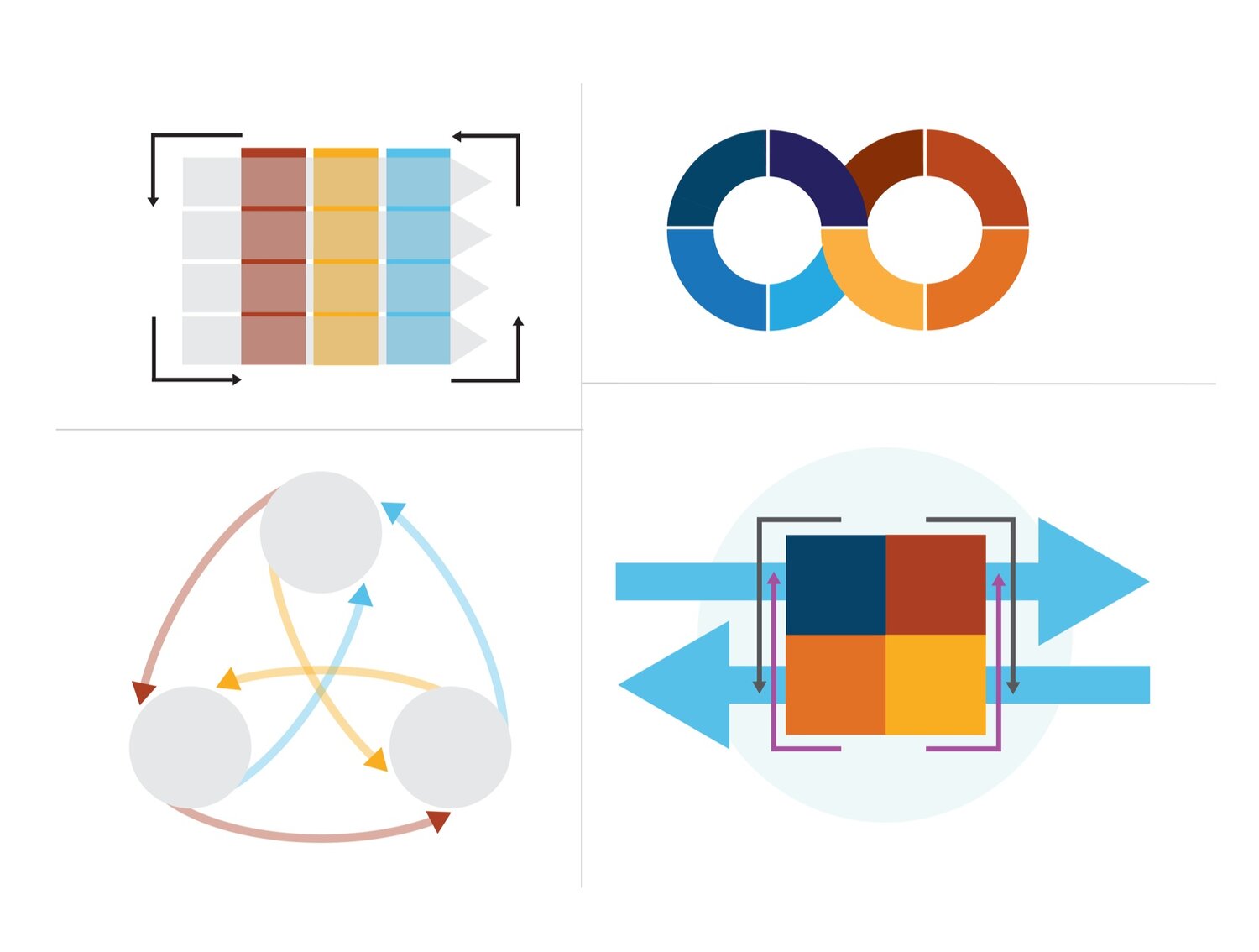
Infographics
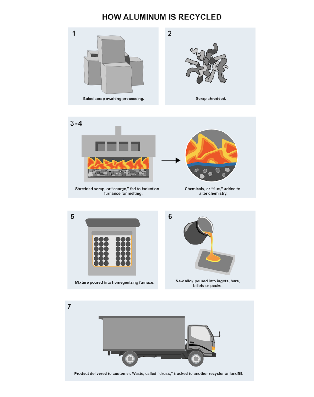
I have experience creating custom infographics for quarterly and yearly nonprofit reports for donors and nonprofit executives. Infographics are a great way to visualize complicated concepts, theories, and cycles for higher comprehension of the organization’s past accomplishments and future goals.
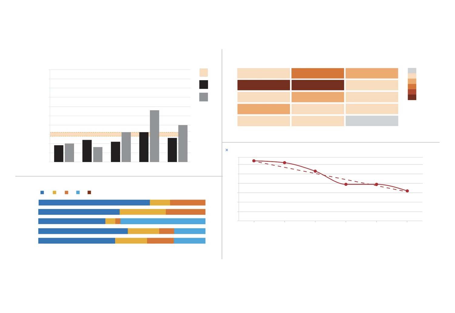
Reports
I enjoy cleaning, analyzing, and visualizing data for various nonprofits and news agencies. I would classify my style of design as clean, modern and effective… anything to make numbers less intimidating and easier to understand for readers. While I have experience in both static and interactive data visualizations, I do prefer the simplicity and ease of use provided by static visuals.
Data journalism
As a classically trained musician, the “future” of classical music was always on my mind. I had always heard about facts and figures that painted a dismal scene for the classical music industry in coming years. During my masters, I had the opportunity to use Google trends for finding search data that would support or disprove this notion. The general trend showed decrease search interest in classical music over time, and it also exposed the seasonal popularity trends that occurred in each yearly cycle. Created with dimple.js and D3.js.
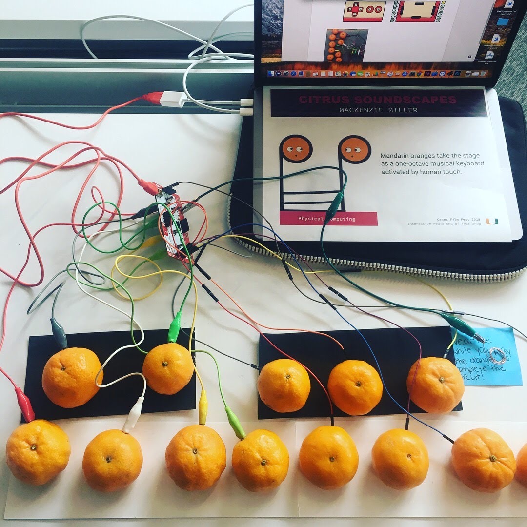
Music installation
My professor told me that I could create a music performance using anything I learned from my undergraduate experience. Anything? I asked. I decided to put a spin on a traditional music performance by changing up the method of accompaniment: 13 oranges taking place of a piano or harpsichord. Blending the old (baroque music) with the new (sense technology). I had to come up with a system of coordinating each specific musical pitch with a corresponding orange using MakeyMakey technology. I used colors to connect the oranges with the notes on the page. The performance was from JS Bach Sonata in C major. Flutist: Caroline Schaffer. This video is from a concert at the University of Miami, featuring the first forty seconds of the piece.
Infographics
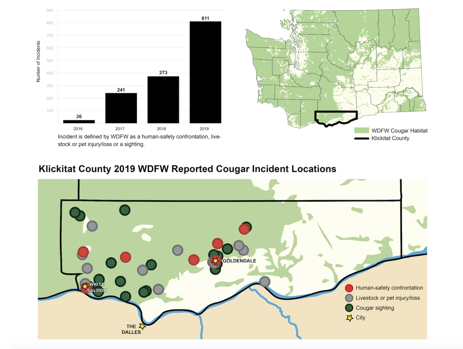
I contributed data analysis and graphics for an article that discussed human-related incidents with wild cougars in Washington State. I thought that this mix of graphics- mapping data and numerical data- created a great combination of related visuals and data, without being too text heavy or number heavy. The custom maps combined several sources of data: state-designated cougar habitat and various incident types involving humans and cougars at state and county level.

Augmented Reality
The was the final project for my Augmented Reality class during my masters degree. The Art History department had developed 3D replicas of various artifacts housed at the Lowe Art Museum on campus and expressed interest in using these 3D replicas for various projects. I designed and created a Unity app that uses those target images to display the 3D replicas with audio accompaniment. We thought it was important to create a museum experience that could be brought home with the viewer.
Magazine spreads
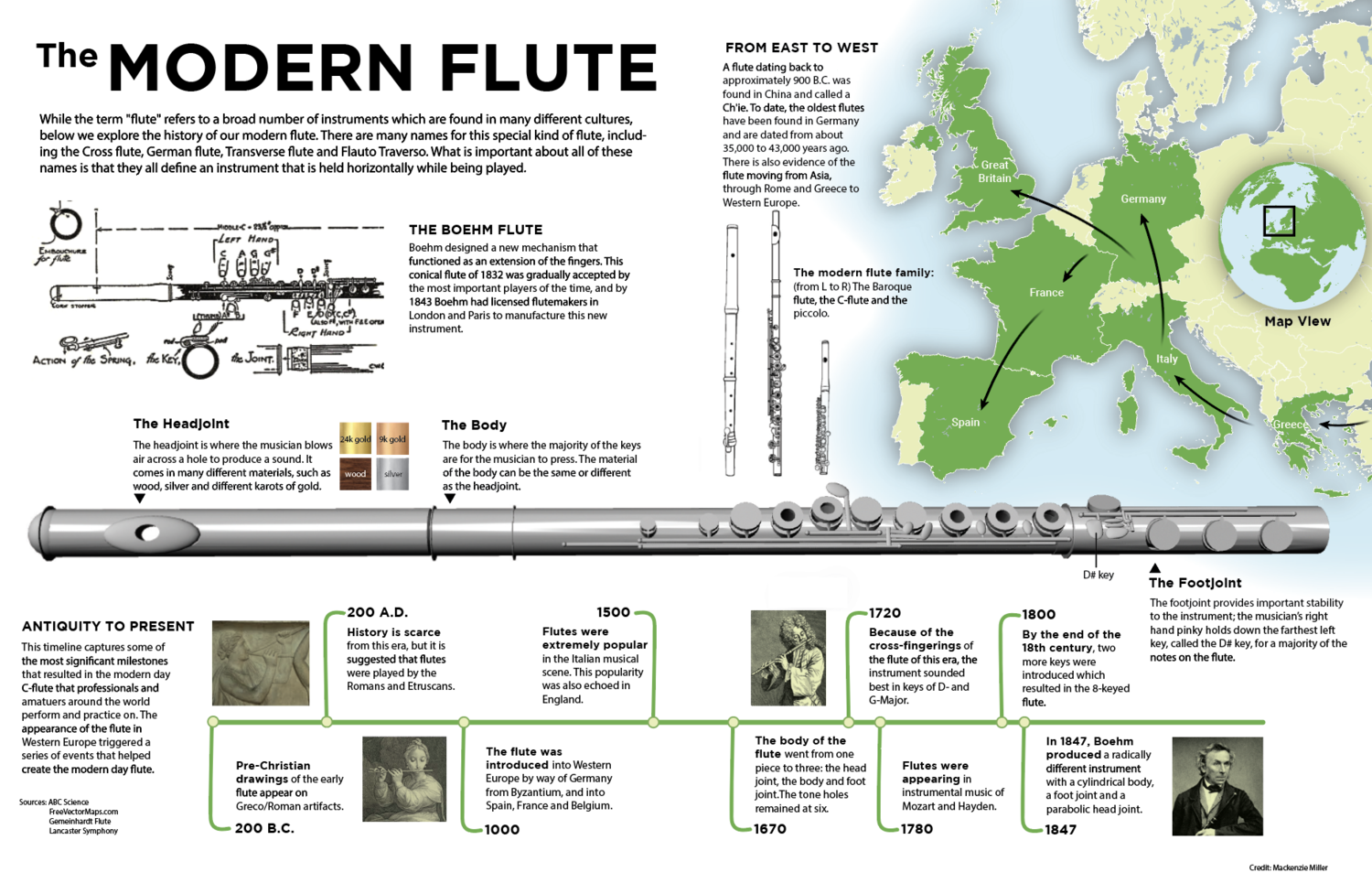
Static tabloid spreads are still an essential part of conveying information, and are only further enhanced by computer generated 3D graphics. I transformed an ordinary webpage detailing the historical origins of the modern flute into a graphical display that conveyed the same information, but using a visual approach that made more sense for the reader. The large silver flute was creating by me in Maya (3D modeling software) from scratch.

Data journalism
I found an interesting data set on the Naxos Music Library website that categorizes many of the times that classical music has existed as soundtrack music, dating back to 1930 all the way through modern times. I analyzed and cleaned the data in Excel, and then created charts using D3.js, Photoshop, and Illustrator. This particular graphic was the main illustration for the project.
Mapping
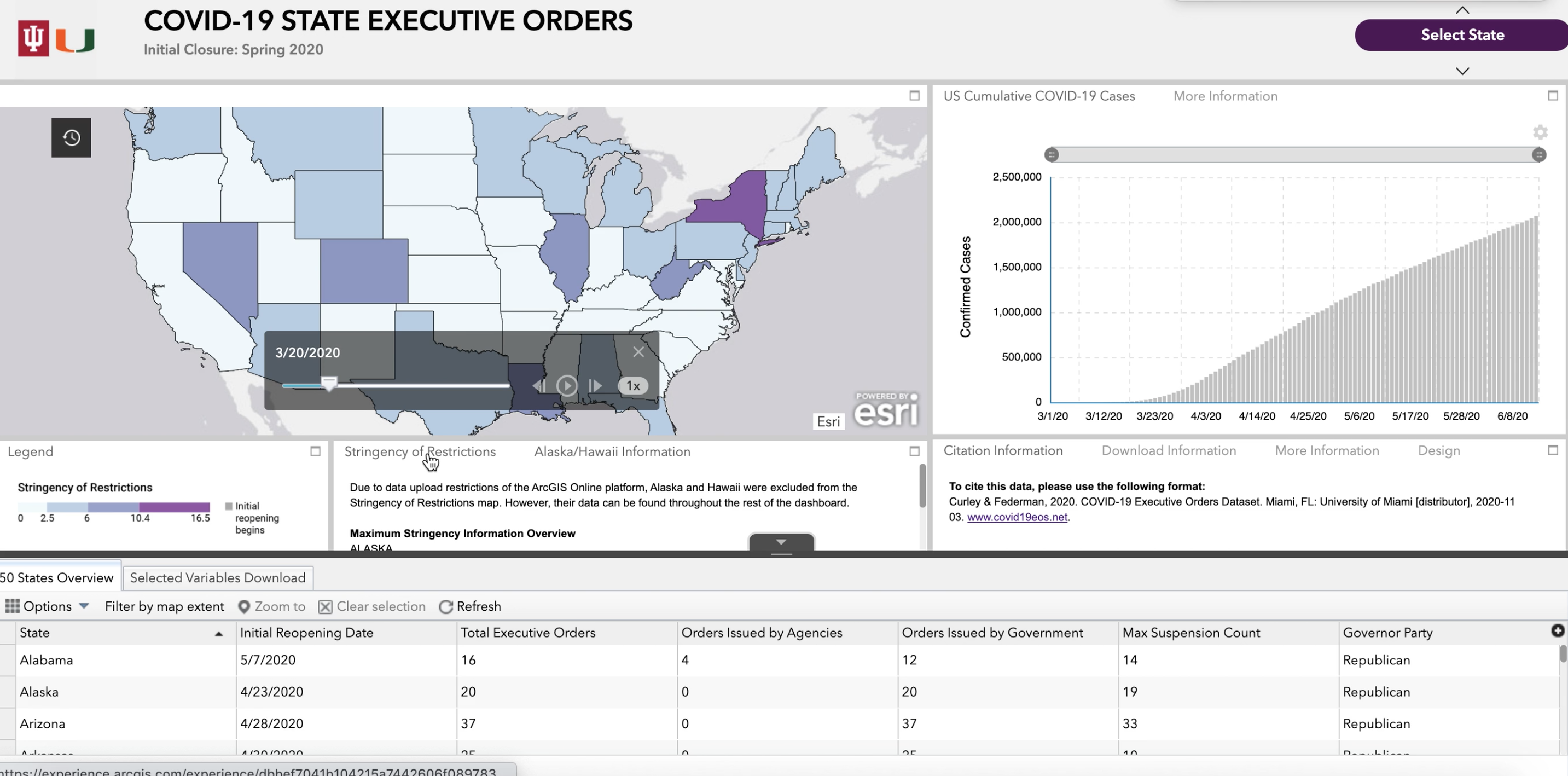
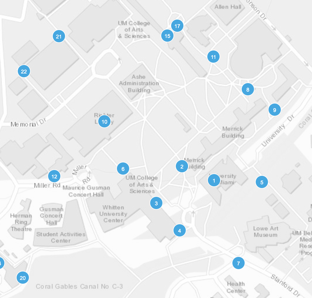
As a student walking around the Coral Gables campus, Emergency Blue Light Phones are constantly part of the landscape we walk around in, even if we don’t directly interact with them most of the time. However, it is comforting to know that the UM Police will be right with you at the quick dial of one of those phones in any uncomfortable situation. I wanted to map all the locations of the Emergency Blue Light Phones on the Coral Gables campus so that students can find the closest telephone to them at any given place on campus. This interactive map could have a home in the UMiami mobile app, which is used by hundreds of students daily for various schedules, tasks, and general information. I used Web ArcGIS to build a webApp that features the University of Miami campus, using GPS data points for all the blue light telephones on the Coral Gables campus hand collected by me.
Museum installation
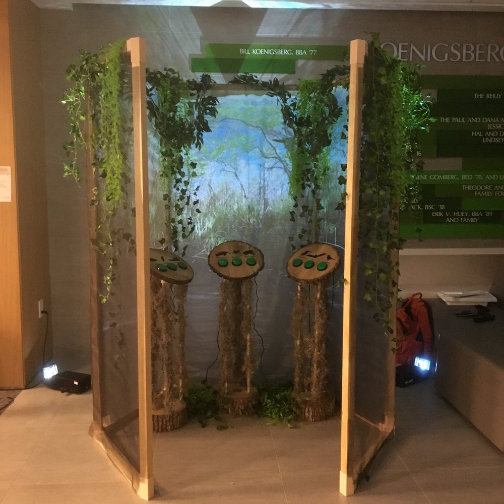
This was the first time that I utilized physical computing for the purpose of a museum exhibit. I had the opportunity to participate in the Accelerate Festival at the Smithsonian in Washington, DC. I created a button interface using Arduino technology accompanied by beautiful videography of the Everglades that would allow people of all ages and accessibility levels to become immersed by the sounds of the Everglades. I used real wood for the platform bases of the buttons, which added an unexpected but most welcome earthy aroma to the installation. The buttons were categorized into land animals, sky animals, and environmental noises.
Infographics
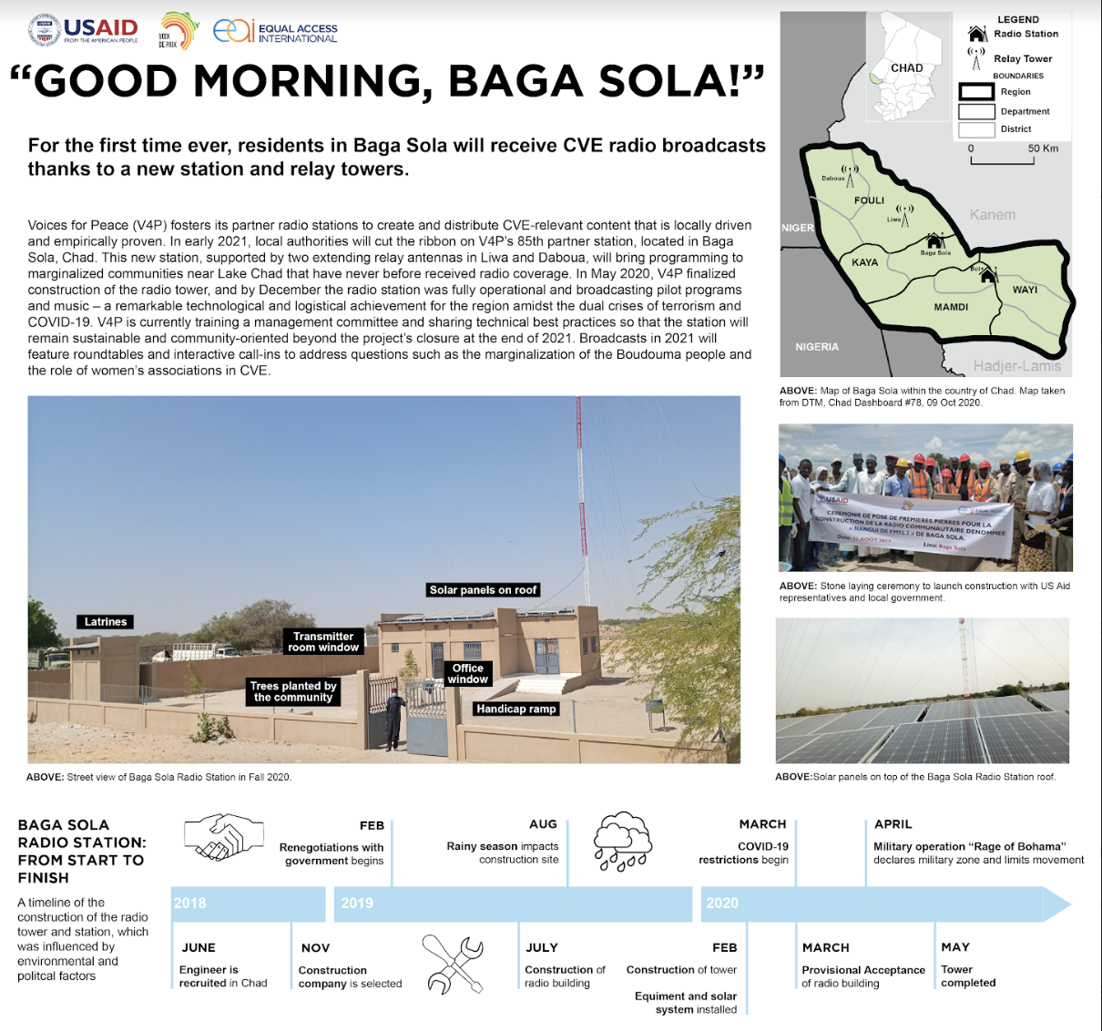
One of my nonprofit clients was interested in visualizing their quarterly updates in a infographic spread, instead of a traditional report. We were able to pull in elements from various visualization tools, such as a map, timeline, photos, etc. so that the US-based stakeholders would have a better visual sense of how their nonprofit was directly impacting projects in Central Africa.
